
The Artist's Palette: A Mirror to Style, Personality, and Unique Voice

In my previous post, "What is Art? Exploring Skills, Originality, and the Artist's Unique Voice", I examined how an artist's distinctive mark-making—whether with brush, pen, or charcoal—functions as a form of personal handwriting, making their work unmistakably their own. Building on that idea, this post focuses on another key element: the artist's palette.
The selection of colors is rarely random; it frequently reflects the artist's inner world, shaping their style and contributing to the individuality of their creations. Research in color psychology supports this connection, indicating that color preferences can align with personality traits and emotional states, much like a signature.
Studies show that palettes can reveal aspects of an artist's temperament—bold, vibrant hues often indicate dynamism or extroversion, while muted or earthy tones suggest introspection or a deep affinity for nature. An artist's palette thus becomes an extension of their unique voice, helping to forge an identifiable aesthetic.
This concept was central to a recent Instagram carousel I shared, comparing artists' palettes to unique handwriting.
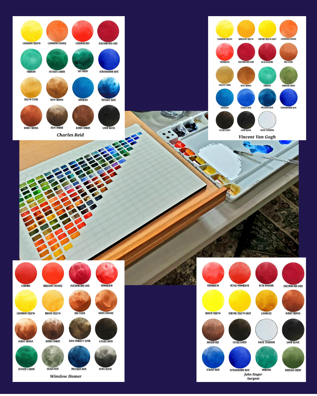
The carousel highlighted how color choices embody personality and style, using examples from my own work and those of renowned watercolorists:
Slide 1: My own watercolor palette (Beverly G. McCarter) – a vibrant spectrum blending cool blues into warm earth tones, echoing my love for dynamic contrasts and natural transitions.
Slide 2: Charles Reid's palette – fresh and lively with balanced primaries like Cadmium Yellow, Alizarin Red Lake, and Ultramarine Blue, mirroring his spontaneous, light-filled style that captures everyday magic.
Slide 3: Vincent van Gogh's set – bold and intense, packed with sunny yellows (like Cadmium and Indian Yellow), fiery reds, and deep blues, reflecting his passionate, emotional depth and turbulent energy.
Slide 4: Winslow Homer's set – earthy and robust, featuring tones like Burnt Sienna, Raw Umber, and Prussian Blue, embodying his rugged, nature-inspired realism and affinity for seascapes and wilderness.
Slide 5: John Singer Sargent's set – elegant and fluid, with rich reds (Vermillion, Rose Madder), cool blues, and viridian greens, showcasing his masterful, impressionistic flair for light and movement.
These palettes serve as windows into the artists' souls.
Color Theory in Watercolor
Understanding color theory is essential for any watercolor artist, as it provides the framework for intentional mixing, harmony, and expression. At its core, color theory explains how colors interact when mixed and how they can evoke specific moods or effects.

A shaded color wheel from the pen of British entomologist Moses Harris, featured in his The Natural System of Colours (1766) [Public Domain courtesy of Wikimedia Commons]
The foundation is the color wheel, built around three primary colors: red, yellow, and blue. Mixing two primaries creates secondary colors—orange (red + yellow), green (yellow + blue), and purple (blue + red). Further mixing yields tertiary colors, such as red-orange or blue-green.
Key concepts include:
Hue: The pure color name (e.g., red, blue).
Value: The lightness or darkness of a color, achieved in watercolor through dilution with water.
Intensity (or saturation): The brightness or dullness of a color; high intensity is vivid, while low intensity appears muted or grayed.
Watercolor's transparency adds unique challenges and opportunities—colors layer subtly, and wet-on-wet mixing creates soft blends, while wet-on-dry allows sharper edges.
Artists often use:
complementary colors (opposites on the wheel, like red and green) for contrast and vibration,
analogous colors (adjacent hues) for harmony, or
triadic color schemes (evenly spaced on the wheel) for balanced energy.
These principles guide palette choices: limited palettes encourage cohesion, while expansive ones allow bold experimentation. Mastering color theory empowers artists to translate personal vision into deliberate, evocative work.
For a striking example of color theory in practice, consider this watercolor by John Singer Sargent, where fluid washes of complementary and analogous hues capture light, movement, and atmosphere with elegant restraint:

John Singer Sargent's elegant 1911 watercolor Simplon Pass: The Tease depicts two women in white dresses lounging on the grass beneath a large parasol, surrounded by vibrant foliage and dappled light. The fluid, translucent washes of purple, green, blue, and warm earth tones exemplify Sargent's masterful impressionistic style, capturing movement, light, and graceful leisure in an Alpine setting. [Public Domain courtesy of WikiMedia Commons]
Now, let's revisit how these palettes reflect the artists' styles, drawing from historical and analytical sources.
Charles Reid: Freshness and Balance
Charles Reid recommended a palette emphasizing saturated primaries and earth tones for fresh, balanced compositions. Colors like Viridian, Yellow Ochre, and Burnt Sienna supported his approachable, observational style, reflecting a personality attuned to harmony and everyday beauty.
[To see an example of Charles Reid's fresh, light-filled watercolor style in action—full of spontaneous energy and balanced color harmony—explore his gallery of original watercolors here: Charles Reid Watercolor Gallery.]
Vincent van Gogh: Intensity and Emotion
Van Gogh's palette shifted to vibrant yellows, reds, and blues in his later works, fueling expressive forms. Pigments like Indian Yellow and Ultramarine Blue conveyed inner turmoil, mirroring his passionate personality.

Vincent van Gogh's famous 1889 oil painting The Starry Night, with its dynamic swirling patterns in deep blues and vibrant yellows, depicting a turbulent night sky filled with glowing stars and a crescent moon over a peaceful village and dark cypress tree. The bold, expressive brushstrokes convey emotional intensity and inner turmoil through vivid contrasts. [Public domain image from Wikimedia Commons]
Winslow Homer: Rugged Earthiness
Homer's palette included robust earth pigments like Burnt Umber and Prussian Blue, ideal for dramatic seascapes conveying isolation and resilience—reflecting a grounded, introspective nature.

Winslow Homer's 1899 oil painting The Gulf Stream portrays a solitary Black man reclining in a damaged, dismasted boat amid turbulent seas, encircled by circling sharks under a threatening sky with distant waterspout. The robust palette of deep blues, teals, and muted earth tones emphasizes themes of human struggle against nature's raw power and isolation. [Public domain image from The Metropolitan Museum of Art / Wikimedia]
John Singer Sargent: Elegance and Fluidity
Sargent's selections of rich reds, cool blues, viridian greens, and subtle earth tones enabled light-capturing effects and subtle vibrancy, supporting his impressionistic focus on grace and observation.

John Singer Sargent's 1912 watercolor Spanish Fountain captures a classical fountain with flowing water and sculptural cherubs, rendered in translucent layers of rich reds, cool blues, viridian greens, and subtle earth tones. The loose, luminous technique demonstrates his palette's elegance and ability to convey light, movement, and atmospheric grace in an impressionistic style. [Public domain image from Wikimedia Commons / The Metropolitan Museum of Art]
In my own practice, the transition from blues to earth tones allows contrasts that echo themes of change and connection.
Ultimately, the palette—guided by color theory—is integral to an artist's voice, alongside skills and originality, forging a unique identity.
What colors define your creative expression?
For further reading: